A recent tweet by Punit Sethi about a Wordpress plugin that reduces Largest Contentful Paint (LCP) without actually improving user experience led to a discussion about faking/gaming metrics.
Core Web Vitals
Google recently started using the LCP and other Core Web Vitals (aka CWV) as a signal for ranking search results. Google's goal in using CWV as a ranking signal is to make the web better for end users. The understanding is that these metrics (Input delays, Layout shift, and Contentful paints) reflect the end user experience, so sites with good CWV scores should (in theory) be better for users... reducing wait time, frustration, and annoyance with the web.
If I've learnt anything over the last 20 years of working with the web, it's that getting to the top of a Google search result page (SRP) is a major goal for most site owners, so metrics that affect that ranking tend to be researched a lot. The LCP is no different, and the result often shows up in such "quick fix" plugins that Punit discusses above. Web performance (Page Load Time) was only ever spoken about as a sub-topic in highly technical spaces until Google decided to start using it as a signal for page ranking, and then suddenly everyone wanted to make their sites faster.
My background in performance
I started working with web performance in the mid 2000s at Yahoo!. We had amazing Frontend Engineering experts at Yahoo!, and for the first time, engineering processes on the front-end were as strong as the back-end. In many cases we had to be far more disciplined, because Frontend Engineers do not have the luxury of their code being private and running on pre-selected hardware and software specs.
At the time, Yahoo! had a performance team of one person — Steve "Chief Performance Yahoo" Souders. He'd gotten a small piece of JavaScript to measure front-end performance onto the header of all pages by pretending it was an "Ad", and Ash Patel, who may have been an SVP at the time, started holding teams accountable for their performance.
Denial
Most sites' first reaction was to deny the results, showing scans from Keynote and Gomez, which at the time only synthetically measured load times from the perspective of well connected backbone agents, and were very far off from the numbers that roundtrip was showing.
The Wall of Shame
I wasn't working on any public facing properties, but became interested in Steve's work when he introduced the Wall of Fame/Shame (depending on which way you sorted it). It would periodically show up on the big screen at URLs (the Yahoo! cafeteria). Steve now had a team of 3 or 4, and somehow in late 2007 I managed to get myself transferred into this team.
The Wall of Shame showed a kind of stock-ticker like view where a site's current performance was compared against its performance from a week ago, and one day we saw a couple of sites (I won't mention them) jump from the worst position to the best! We quickly visited the sites and timed things with a stop-watch, but they didn't actually appear much faster. In many instances they might have even been slower. We started looking through the source and saw what was happening.
The sites had discovered AJAX!
Faking it
There was almost nothing loaded on the page before the onload event. The only content was some JavaScript that ran on onload and downloaded the framework and data for the rest of the site. Once loaded, it was a long-lived single page application with far fewer traditional page views.
Site owners argued that it would make the overall experience better, and they weren't intentionally trying to fake things. Unfortunately we had no way to actually measure this, so we added a way for them to call an API when their initial framework had completed loading. That way we'd get some data to trend over time.
At Yahoo! we had the option of speaking to every site builder and to work with them to make things better. Outside though, is a different matter.
Measuring Business Impact
Once we'd started LogNormal (and continuing with mPulse), and were serving multiple customers, it soon became clear that we'd need both business and engineering champions at each customer site. We needed to sell the business case for performance, but also make sure engineering used it for their benefit rather than gaming the metrics. We started correlating business metrics like revenue, conversions, and activity with performance. There is no cheap way to game these metrics because they depend on the behaviour of real users.
Sites that truly care about performance and the business impact of that performance, worked hard to make their sites faster.
This changed when Google started using speed as a ranking signal.
With this change, sites now had to serve two users, and when in conflict, Real Users lost out to Googlebot. After all, you can't serve real users if they can't see your site. Switching to CWV does not change the situation because things like Page Load Time, Largest Contentful Paint, and Layout Shift can all be faked or gamed by clever developers.
Ungameable Metrics
This brings us back to the metrics that we've seen couldn't be gamed. Things like time spent on a site, bounce rate, conversions, and revenue, are an indication of actual user behaviour. Users are only motivated by their ability to complete the task they set out to do, and using this as a ranking signal is probably a better idea.
Unfortunately, activity, conversions, and revenue are also fairly private corporate data. Leaking this data can affect stock prices and clue competitors in to how you're doing.
User frustration & CrUX
Now the goal of using these signals is to measure user frustration. Google Chrome periodically sends user interaction measurements back to their servers, collected as part of the Chrome User Experience report (CrUX). This includes things like the actual user experienced LCP, FID, and CLS In my opinion, it should also include measures like rage clicks, missed, and dead clicks, jank while scrolling, CPU busy-ness, battery drain, etc. Metrics that only come into play while a user is interacting with the site, and that affect or reflect how frustrating the experience may be.
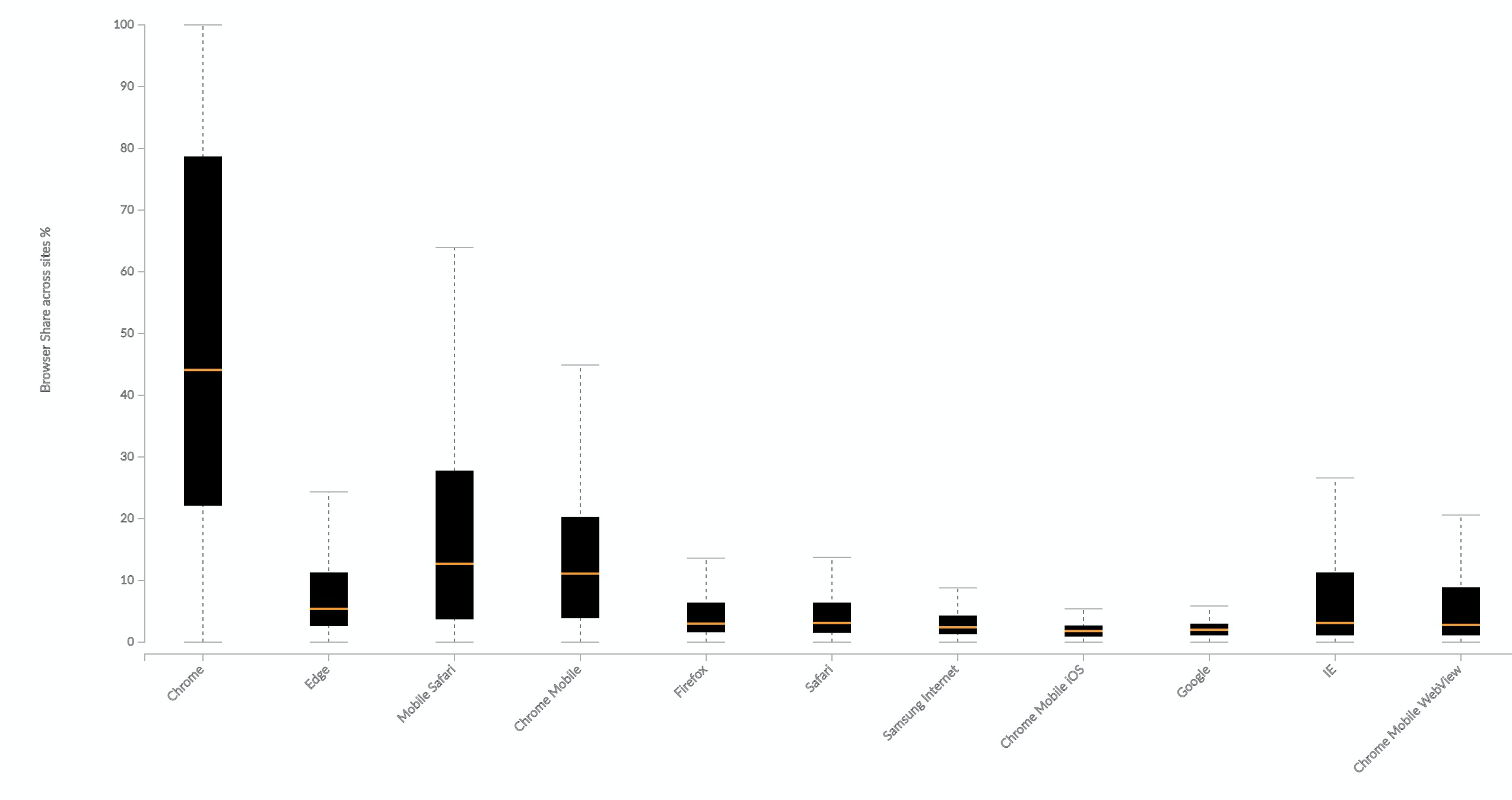
It would also need to have buy-in from a few more browsers. Chrome has huge market share, but doesn't reflect the experience of all users. Data from mPulse shows that across websites, Chrome only makes up, on average, 44% of page loads. Edge and Safari (including mobile) also have a sizeable share. Heck, even IE has a 3% share on sites where it's still supported.
In the chart below, each box shows the distribution of a browser's traffic share across sites. The plot includes (in descending order of number of websites with sizeable traffic for that browser) Chrome, Edge, Mobile Safari, Chrome Mobile, Firefox, Safari, Samsung Internet, Chrome Mobile iOS, Google, IE, and Chrome Mobile WebView.
It's unlikely that other browsers would trust Google with this raw information, so there probably needs to be an independent consortium that collects, anonymizes, and summarizes the data, and makes it available to any search provider.
Using something like the Frustration Index is another way to make it hard to fake ranking metrics without also accidentally making the user experience better.
Comparing these metrics with Googlebot's measures could hint at whether the metrics are being gamed or not, or perhaps it even lowers the weight of Googlebot's measures, restricting it only to pages that haven't received a critical mass of users.
We need to move the balance of ranking power back to the users whose experience matters!
So you’ve come here for a post about performance, but here I am talking about emotion… what gives? I hope that if you haven’t already, then as this post progresses, you’ll see that performance and emotion are closely intertwined.
While we may be web builders, our goal is to run a business that provides services or products to real people. The website we build is a means of connecting people to that service or product.
Browsers now provide us with many APIs to fetch performance metrics that help site owners make sites faster. Concurrently, the Core Web Vitals initiative from Google helps identify metrics that most affect the user experience.
These metrics, while useful operationally, don’t give us a clear picture of the user experience, or why we need to optimise them for our site in particular. They don’t answer the business or human questions of, “Why should we invest in web performance?” (v/s for example, a feature that customers really want), or even more specifically, “What should we work on first?”.
Andy Davies recently published a post about the link between site speed and business outcomes…
Context influences experience,
Experience influences behaviour,
Behaviour influences business outcomes.
All of the metrics we collect and optimise for deal with context, and we spend very little time measuring and optimising the rest of the flow.
Switching Hats
Over the last decade working on boomerang and mPulse, we slowly came to the realisation that we’ve been approaching performance metrics from a developer centric view. We’d been drawing on our experience as developers – users who have browser dev tools shortcuts committed to muscle memory. We were measuring and optimising the metrics that were useful and easy to collect from a developer’s point of view.
Once we switched hats to draw on our experiences as consumers of the web, the metrics that really matter became clearer. We started asking better questions...
What does it mean that performance improved by 100ms?
Are all 100ms the same?
Do all users perceive time the same way?
Is performance all that matters?
In this post, we’ll talk about measuring user experience and its effects on behaviour, what we can infer from that behaviour, and how it affects business outcomes.
Delight & Frustration
In Group Psychology and the Analysis of Ego, Freud notes that “Frustration occurs when there is an inhibiting condition that interferes with or stops the realization of a goal.”
Users visit our sites to accomplish a goal. Perhaps they’re doing research to act on later, perhaps they want to buy something, perhaps they’re looking to share an article they read a few days ago.
Anything that slows down or prevents the user from accomplishing this goal can cause frustration. On the other hand, making their goal easy to find and achieve can be delightful.
How a user feels when using our site affects whether they’ll come back and “convert” into customers (however you may define convert).
The Link Between Latency & Frustration
In 2013, Tammy Everts and her team at Radware ran a usability lab experiment. The study hooked participants up to EEG devices, and asked them to shop on certain websites. Half the users had an artificial delay added to their browsing experience and neither group were made aware of the performance changes. They all believed they were testing the usability of the sites. The study showed that...
A 500ms connection speed delay resulted in up to a 26% increase in peak frustration and up to an 8% decrease in engagement.
Similarly in 2015, Ericsson ConsumerLab neuro research studied the effects of delayed web pages on mobile users and found that “Delayed web pages caused a 38% rise in mobile users' heart rates — equivalent to the anxiety of watching a horror movie alone.”
This may not be everyone’s cup of tea, and the real implication is that users make a conscious or unconscious decision on whether to stick around, return, or leave the site.
Cognitive Bias
Various cognitive biases affect how individual experiences affect perception and behaviour. Understanding these biases, and intervening when an experience tends negative can improve the overall experience.
Perceptual Dissonance
Also known as Sensory Dissonance, Perceptual Dissonance results from unexpected outcomes of common actions.
The brain’s predictive coding is what helps you do things like “figure out if a car coming down the road is going slow enough for you to cross safely”. A perceptive violation of this coding is useful in that it helps us learn new things, but if that violation breaks long standing “truths”, or if violations are inconsistent, it makes learning impossible, and leads to psychological stress, and frustration.
On the web, users expect websites to behave in a certain way. Links should be clickable, sites should in general scroll vertically, etc. Things like jank while scrolling, nothing happening when a user clicks a link (dead clicks), or a click target moving as the user attempts to click on it (layout shift) causes perceptual dissonance and frustration.
If these bad experiences are consistent, then users come to expect them. Our data shows that users from geographies where the internet is slower than average tend to be more patient with web page loads.
Survivorship Bias
We only measure users who can reach our site. For some users, a very slow experience is better than an unreachable site.
In 2012, after Youtube made their site lighter, Chris Zakariahs found that aggregate performance had gotten worse. On delving into the data, they found that new users who were previously unable to access the site were now coming in at the long tail. The site appeared slower in aggregate, but the number of users who could use it had gone up.
Negativity Bias
Users are more likely to remember and talk to their friends about their bad experiences with a site than they are about the good ones. We need only run a twitter search for “$BRAND_NAME slow” to see complaints about bad experiences.
Bad experiences are also perceived to be far more intense than equivalent good experiences. To end up with a neutral overall experience, bad experiences need to be balanced with more intense good experiences. A single bad experience over the course of the session makes it harder to result in overall delight.
Active Listening
Research shows that practicing Active Listening can have a big impact on countering Negativity Bias. Simply acknowledging when you’ve screwed up and didn’t meet the user’s expectations can alleviate negative perception. If we detect, via JavaScript, that the page is taking too long to transition between loading states, we could perhaps display a message that acknowledges and apologizes for things going slower than expected.
Hey, we realise that it’s taking a little longer than expected to get to what you want. You deserve better. We’re sorry and hope you’ll stick around a bit.
Users will be more forgiving if their pain is acknowledged.
Measuring Emotion
There are many ways we could measure the emotional state of users using our site. These range from active engagement to completely creepy. Naturally not all of these will be applicable for websites...
Use affective computing (facial analysis, EEGs, pulse tracking, etc.)
Ask the user via a survey popover
Business outcomes of behaviour
Behavioural analysis
Affective Computing
For website owners, affective computing isn’t really in play. Things like eye tracking, wireless brain interfaces, and other affective computing methodologies are too intrusive. They work well in a lab environment where users consent to this kind of tracking and can be hooked up to measurement devices. This is both inconvenient, and creepy to run on the web.
Ask the user
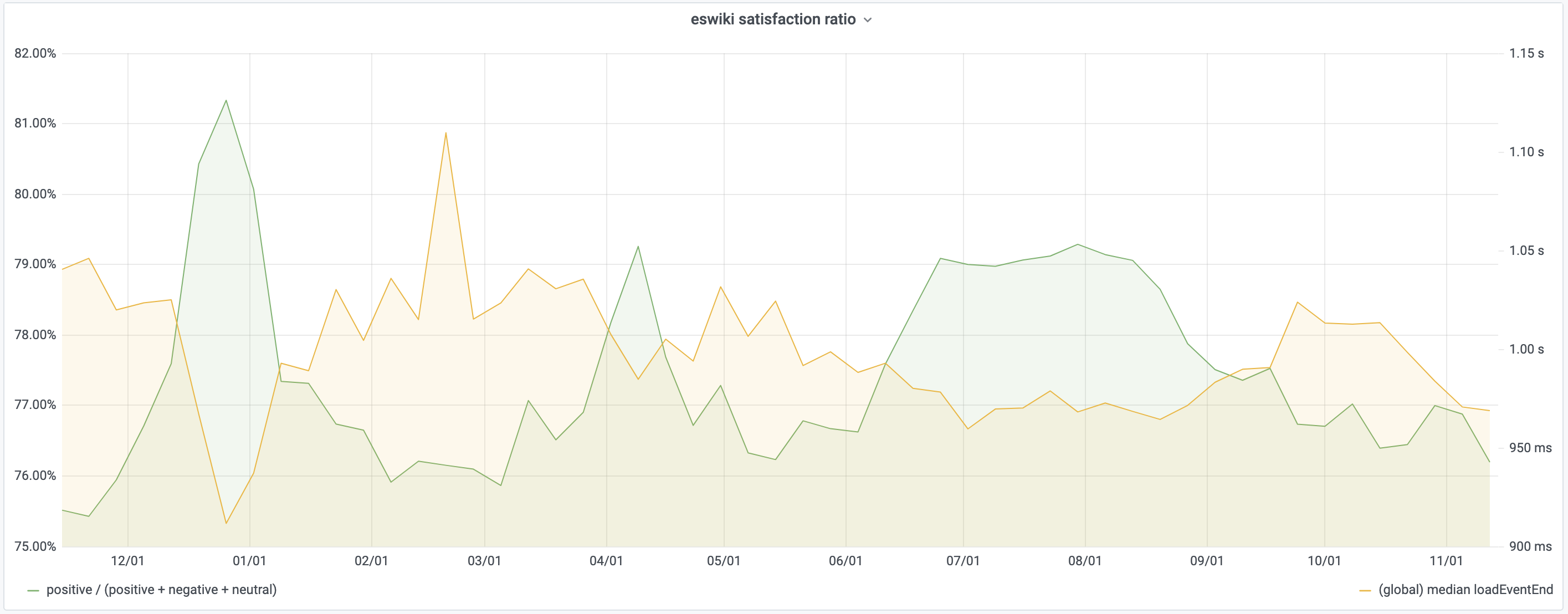
Asking the user can be effective as shown by a recent study from Wikipedia. The study used a very simple Yes/No/No Comment style dialog with randomized order. They found that users’ perceived quality of experience is inversely proportional to median load time. A 4% temporary improvement to page load time resulted in an equally temporary 1% extra satisfied users.
It’s hard to quantify what kinds of experiences would reduce the effects of selection bias and result in users choosing to answer the survey, or how you’d want to design the popover to increase self-selection.
The Hawthorne effect, on the other hand, suggests that individuals change the way they react to stimuli if they know they’re being measured or observed.
Business Outcomes
Measuring business outcomes is necessary but it can be hard to identify what context resulted in an outcome. One needs to first understand the intermediate steps of experience and behaviour. Did a user bounce because the experience was bad, or did they just drop in to do some research and will return later to complete a purchase?
Behavioural analysis
Applying the results of lab based research to users actively using a website can help tie experience to behaviour. We first need to introduce some new terms that we’ll define in the paragraphs that follow.
Rage Clicks, Wild Mouse, Scrandom, and Backtracking are behavioural signals we can use. In conjunction with when in a page’s life cycle users typically expect different events to take place, they can paint a picture of user expectations and behaviour.
Correlating these metrics with contextual metrics like Core Web Vitals on one hand, and business outcomes on the other can help us tell a more complete story of which performance metrics we should care about and why.
Rage, Frustration & Confusion
To measure Rage, Frustration & Confusion, we look at Rage Clicks, Wild Mouse and Backtracking.
Rage Clicks
Rage Clicks occur when users rapid-fire click on your site. It is the digital equivalent of cursing to release frustration. We’ve probably all caught ourselves rage clicking at some point. Click once, nothing happens, click again, still nothing, and then on and on. This could be a result of interaction delays, or of users expecting something to be clickable when it isn't.
Rage clicks can be measured easily and non-intrusively, and are easy to analyse.
On the other hand, random patterns, or jumping between options in a form can suggest confusion, doubt, and frustration.
See Churruca, 2011 for the full study.
The JavaScript library Dawdle.js can help classify these mouse patterns.
Scrandom
Scrandom is the act of randomly scrolling the page up and down with no particular scroll target. This can indicate that a user is unsure of the content, the page is too long, or is waiting for something to happen and making sure that the page is still responsive without accidentally clicking anything.
Backtracking
Backtracking is the process of hitting the back button on the web. Users who are confused or lost on your site may hit the back button often to get back to a safe space. This behaviour may manifest itself in different ways, but can often be identified with very long sessions that appear to loop.
Tie this into the Page Load Timeline
In his post on Web Page Usability, Addy Osmani states that loading a page is a progressive journey with four key moments to it: Is it happening? Is it useful? Is it usable? and Is it delightful? And he includes this handy graphic to explain it:
The first three are fairly objective. With only minor differences between browsers, it’s straightforward to pull this information out of standard APIs, and possibly supplement it with custom APIs like User Timing.
We’ve found that over 65% of users expect a site to be usable after elements have started becoming visible but before it is actually Interactive. Contrast that with 30% who will wait until after the onload event has fired.
Correlating Rage with Loading Events
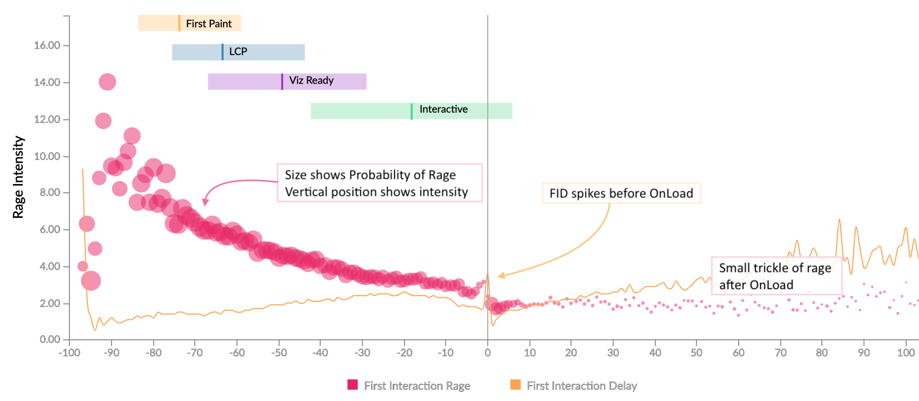
Comparing the points in time when users rage click with the loading timeline above, we see some patterns.
The horizontal axis on this chart is time as a relative percent of the full page load time. -50 indicates half of the page load time while +50 is 1.5x the page load time. The vertical axis indicates intensity of rage while point radius indicates probability of rage clicks at that time point. The coloured bars indicate 25th to 75th percentile ranges for the particular timer relative to full page load with the line going through indicating the median.
We see a large amount of rage between content becoming visible and the page becoming interactive. Users expect to be able to interact with the page soon after content becomes visible, and if that expectation isn’t met, it results in rage clicking.
We also see a small stream of rage clicks after the page has completed loading, caused by interaction delays.
There’s a small gap just before the onload event fires. The onload event is when many JavaScript event handlers run, which in turn result in Long Tasks, and increased Interaction Delays. What we’re seeing here is not the absence of any interaction, but survivorship bias where the interactions that happen at that time aren’t captured until later.
The horizontal axis on this chart is relative time along the page load timeline. We looked at various combinations of absolute and relative time across multiple timers, and it was clear that relativity is a stronger model, which brings us to a new metric based on relative timers...
Frustration Index
The frustration index, developed by Tim Vereecke, is a measure based on the relation between loading phases. We’ve seen that once one event occurs, users expect the next to happen within a certain amount of time. If we miss that expectation, the user's perception is that something is stopping or inhibiting their ability to complete their task, resulting in frustration.
The Frustration Index encapsulates that relationship. The formula we use is constantly under development as research brings new things to light, but it’s helpful to visit the website to understand exactly how it works and see some examples.
So how do we know that this is a good metric to study?
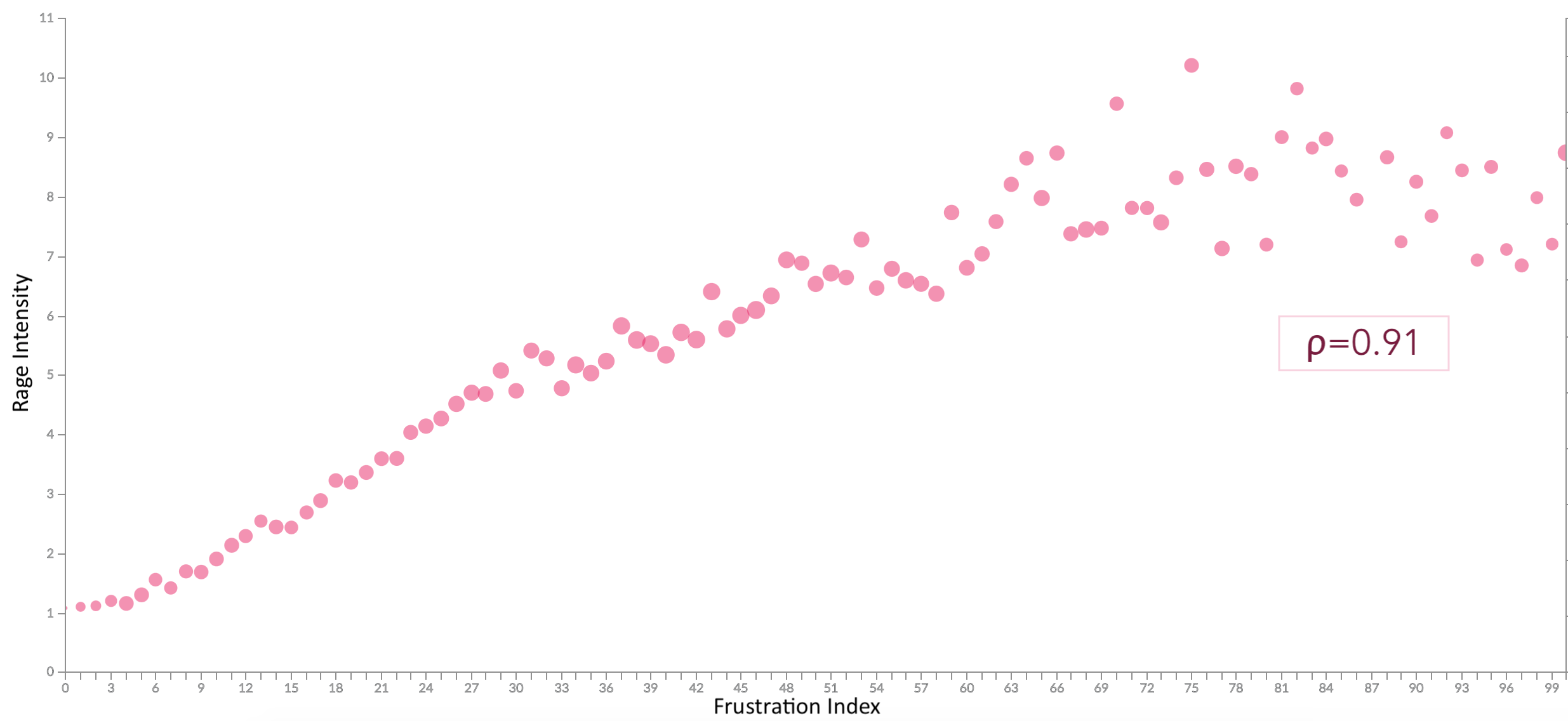
Correlating Rage & Frustration
It turns out that there is a strong correlation (ρ=0.91) between the intensity of rage (vertical axis) that a user expresses and the calculated frustration index (horizontal axis) of the page.
Rather than looking at individual timers for optimization, it is better to consider all timers in cohesion. Improving one of them changes the user’s expectation of when other events should happen and missing that expectation results in frustration.
However, further to this, the formula is something we can apply client-side to determine if we’re meeting expectations, and practice active listening if we’re not.
Correlating Frustration & Business Outcomes
Looking at the correlation between Frustration Index and certain business metrics also shows a pattern.
Bounce Rate is proportional to the frustration index with a sharp incline around what we call the LD50 point (for this particular site). ρb=0.65
Average Time spent on the site goes down as frustration increases, again sharply at first and then tapering off. ρt=-0.49
In biology, it’s the dosage of a toxin that kills off 50% of the sample, be it tumour cells, or mice.
On the web, we think of it more in terms of when 50% of users decide not to move on in their journey. We could apply it to bounce rate, or retention rate, or any other rate that’s important to your site, and the “dose”, may be a timer value, or frustration index, or anything else. Depending on the range of the metric in question, we may also use a percentile other than the median, for example, LD25 or LD75.
This isn’t a single magic number that works for all websites. It isn’t even a single number that works for all pages on a site or for all users. Different pages and sites have different levels of importance to a user, and a user’s emotional state, or even the state of their device (eg: low battery), when they visit your site can affect how patient they are.
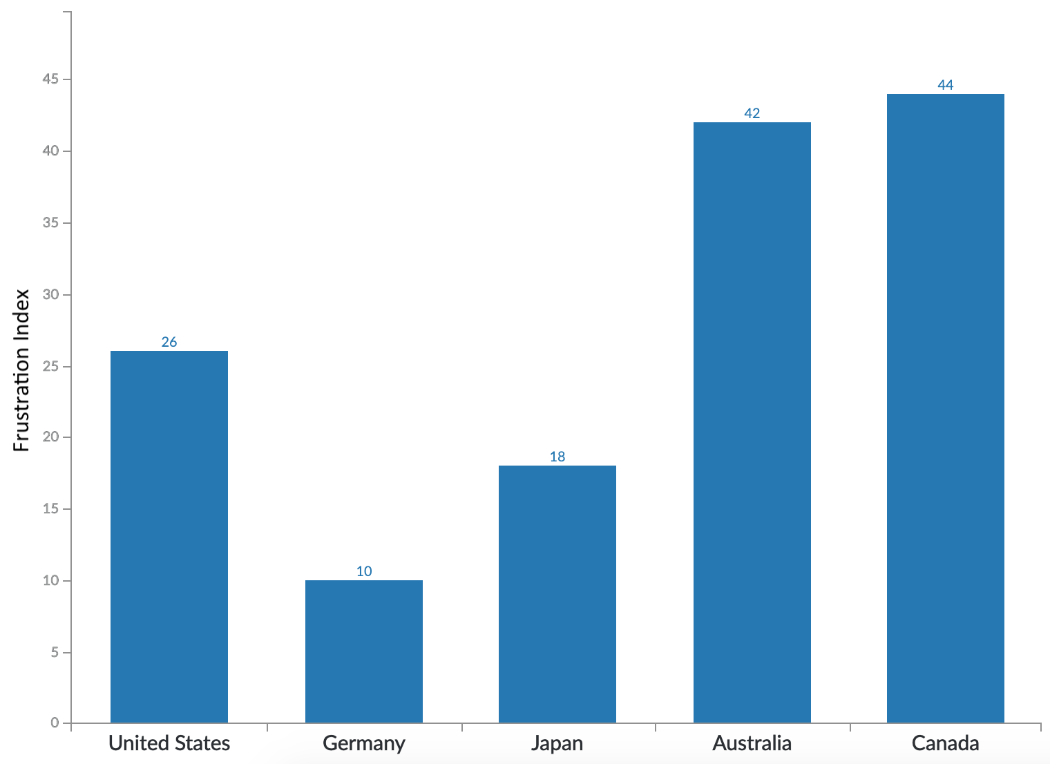
Patience is also a Cultural Thing
People from different parts of the world have a different threshold for frustration.
Many of our customers have international audiences and they have separate sites customized for each locale. We find that users from different global regions have different expectations of how fast a site should be.
In this chart, looking at 5 high GDP countries (that we have data for), we see a wide distribution in LD25 value across them, ranging from a value of 10 for Germany to the 40s for Australia and Canada. It’s not shown in this chart, but the difference is even wider when we look at LD50, with Germany at 14 and Canada at 100.
So how fast should our site be?
We’ve heard a lot about how our site’s performance affects the user experience, and consequently how people feel when using our site. We’ve seen how the “feel” of a site can affect the business, but what does all of that tell us about how to build our sites?
How fast should we be to reduce frustration?
What should we be considering in our performance budgets?
How do we leave our users feeling happy?
I think these may be secondary questions…
A better question to start with, is:
Will adding a new feature delight or frustrate the user?
Thanks to Andy Davies, Nic Jansma, Paul Calvano, Tim Vereecke, and Cliff Crocker for feedback on an earlier draft of this post.
Thanks also to the innumerable practitioners whose research I've built upon to get here including Addy Osmani, Andy Davies, Gilles Dubuc, Lara Hogan, Nicole Sullivan, Silvana Churruca, Simon Hearne, Tammy Everts, Tim Kadlec, Tim Vereecke, the folks from Fullstory, and many others that I'm sure I've missed.
Tammy and Cliff are my colleagues at SOASTA, and this talk is based on a lot of the data that I've been working to collect over the last few years. I'm torn between this and the next one also at the same time.
Todd & Matt are also colleagues at SOASTA, and this talk is about the infrastructure we've developed to collect the metrics that are covered in the talk that Tammy & Cliff are doing. I really wish I could be at both.
At LogNormal, we’re all about collecting and making sense of real user performance data.
We collect over a billion data points a month, and there’s a lot you can tell about the web and your users if you know what to
look at in your data. In this post, I’d like to go over some of the statistical methods we use to make sense of this data.
You’d use these methods if you wanted to build your own Real User Measurement (RUM) tool.
The entire topic is much larger than I can cover in a single post, so go through the references if you’re interested in more information.
As Web developers, we have an affinity for developing with JavaScript. Whatever the language used in the back end,
JavaScript and the browser are the primary language-platform combination available at the user’s end. It has many
uses, ranging from silly to experience-enhancing.
In this post, we’ll look at some methods of manipulating JavaScript to determine various network characteristics from
within the browser — characteristics that were previously available only to applications that directly interface
with the operating system. Much of this was discovered while building the Boomerang
project to measure real user performance.
What’s In A Network Anyway?
The network has many layers, but the Web developers among us care most about HTTP, which runs over TCP and IP (otherwise known jointly as the Internet protocol suite). Several layers are below that, but for the most part, whether it runs on copper, fiber or homingpigeons does not affect the layers or the characteristics that we care about.
Network Latency
Network latency is typically the time it takes to send a signal across the network and get a response. It’s also often called roundtrip time or ping time because it’s the time reported by the ping command. While this is interesting to network engineers who are diagnosing network problems, Web developers care more about the time it takes to make an HTTP request and get a response. Therefore, we’ll define HTTP latency as the time it takes to make the smallest HTTP request possible, and to get a response with insignificant server-processing time (i.e. the only thing the server does is send a response).
Cool tip: Light and electricity travel through fiber and copper at 66% the speed of light in a vacuum, or 20 × 108 metres per second. A good approximation of network latency between points A and B is four times the time it takes light or electricity to travel the distance. Greg’s Cable Map is a good resource to find out the length and bandwidth of undersea network cables. I’ll leave it to you to put these pieces together.
Network Throughput
Network throughput tells us how well a network is being utilized. We may have a 3-megabit network connection but are effectively using only 2 megabits because the network has a lot of idle time.
DNS
DNS is a little different from everything else we care about. It works over UDP and typically happens at a layer that is transparent to JavaScript. We’ll see how best to ascertain the time it takes to do a DNS lookup.
There is, of course, much more to the network, but determining these characteristics through JavaScript in the browser gets increasingly harder.
Measuring Network Latency With JavaScript
My first instinct was that measuring latency simply entailed sending one packet each way and timing it. It’s fairly easy to do this in JavaScript:
We start a timer, then load a 1 × 1 pixel GIF and measure when its onload event fires. The GIF itself is 35 bytes in size and so fits in a single TCP packet even with HTTP headers added in.
This kinda sorta works, but has inconsistent results. In particular, the first time you load an image, it will take a little longer than subsequent loads — even if we make sure the image isn’t cached. Looking at the TCP packets that go across the network explains what’s happening, as we’ll see in the following section.
TCP Handshake and HTTP Keep-Alive
When loading a Web page or image or any other Web resource, a browser opens a TCP connection to the specified Web server, and then makes an HTTP GET request over this connection. The details of the TCP connection and HTTP request are hidden from users and from Web developers as well. They are important, though, if we need to analyze the network’s characteristics.
The first time a TCP connection is opened between two hosts (the browser and the server, in our case), they need to “handshake” This takes place by sending three packets between the two hosts. The host that initiates the connection (the browser in our case) first sends a SYN packet, which kind of means, “Let’s SYNc up. I’d like to talk to you. Are you ready to talk to me?” If the other host (the server in our case) is ready, it responds with an ACK, which means, “I ACKnowledge your SYN.” And it also sends a SYN of its own, which means, “I’d like to SYNc up, too. Are you ready?” The Web browser then completes the handshake with its own ACK, and the connection is established. The connection could fail, but the process behind a connection failure is beyond the scope of this article.
Once the connection is established, it remains open until both ends decide to close it, by going through a similar handshake.
When we throw HTTP over TCP, we now have an HTTP client (typically a browser) that initiates the TCP connection and sends the first data packet (a GET request, for example). If we’re using HTTP/1.1 (which almost everyone does today), then the default will be to use HTTP keep-alive (Connection: keep-alive). This means that several HTTP requests may take place over the same TCP connection. This is good, because it means that we reduce the overhead of the handshake (three extra packets).
Now, unless we have HTTP pipelining turned on (and most browsers and servers turn it off), these requests will happen serially.
We can now modify our code a bit to take the time of the TCP handshake into account, and measure latency accordingly.
With this code, we can measure both latency and the TCP handshake time. There is a chance that a TCP connection was already active and that the first request went through on that connection. In this case, the two times will be very close to each other. In all other cases, rtt, which requires two packets, should be approximately 66% of tcp, which requires three packets. Note that I say “approximately,” because network jitter and different routes at the IP layer can make two packets in the same TCP connection take different
lengths of time to get through.
You’ll notice here that we’ve ignored the fact that the first image might have also required a DNS lookup. We’ll look at that in part 2.
Measuring Network Throughput With JavaScript
Again, our first instinct with this test was just to download a large image and measure how long it takes. Then size/time should tell us the throughput.
For the purpose of this code, let’s assume we have a global object called image, with details of the image’s URL and size in bits.
// Assume global object// image={ url: "", size: "" }varts,rtt,bw,img=newImage;img.onload=function(){rtt=(+newDate-ts);bw=image.size*1000/rtt;// rtt is in ms};ts=+newDate;img.src=image.url;
Once this code has completed executing, we should have the network throughput in kilobits per second stored in bw.
Unfortunately, it isn’t that simple, because of something called TCP slow-start.
Slow-Start
In order to avoid network congestion, both ends of a TCP connection will start sending data slowly and wait for an acknowledgement (an ACK packet). Remember than an ACK packet means, “I ACKnowledge what you just sent me.” Every time it receives an ACK without timing out, it assumes that the other end can operate faster and will send out more packets before waiting for the next ACK. If an ACK doesn’t come through in the expected timeframe, it assumes that the other end cannot operate fast enough and so backs off.
This means that our throughput test above would have been fine as long as our image is small enough to fit within the current TCP window, which at the start is set to 2. While this is fine for slow networks, a fast network really wouldn’t be taxed by so small an image.
Instead, we’ll try by sending across images of increasing size and measuring the time each takes to download.
For the purpose of the code, the global image object is now an array with the following structure:
varimage=[{url:...,size:...}];
An array makes it easy to iterate over the list of images, and we can easily add large images to the end of the array to test faster network connections.
Unfortunately, this breaks down when a very slow connection hits one of the bigger images; so, instead, we add a timeout value for each image, designed so that we hit upon common network connection speeds quickly. Details of the image sizes and timeout values are listed in this spreadsheet.
This looks much better — and works much better, too. But we’d see much variance between multiple runs. The only way to reduce the error in measurement is to run the test multiple times and take a summary value, such as the median. It’s a tradeoff between how accurate you need to be and how long you want the user to wait before the test completes. Getting network throughput to an order of magnitude is often as close as you need to be. Knowing whether the user’s connection is around 64 Kbps or 2 Mbps is useful, but determining whether it’s exactly 2048 or 2500 Kbps is much less useful.
Summary And References
That’s it for part 1 of this series. We’ve looked at how the packets that make up a Web request get through between browser and server, how this changes over time, and how we can use JavaScript and a little knowledge of statistics to make educated guesses at the characteristics of the network that we’re working with.
In the next part, we’ll look at DNS and the difference between IPv6 and IPv4 and the WebTiming API. We’d love to know what you think of this article and what you’d like to see in part 2, so let us know in a comment.
![[philiptellis]](https://en.gravatar.com/userimage/3079306/f13167d69aa4e1cb5e5f131af4e38e3e.jpeg)