![[philiptellis]](https://en.gravatar.com/userimage/3079306/f13167d69aa4e1cb5e5f131af4e38e3e.jpeg)
At LogNormal, we’re all about collecting and making sense of real user performance data. We collect over a billion data points a month, and there’s a lot you can tell about the web and your users if you know what to look at in your data. In this post, I’d like to go over some of the statistical methods we use to make sense of this data.
You’d use these methods if you wanted to build your own Real User Measurement (RUM) tool.
The entire topic is much larger than I can cover in a single post, so go through the references if you’re interested in more information.
Data and Distribution
The data we’re looking at is the time between the user initiating an action (like a page load), and that action completing. In most cases, this is the time from a user requesting a page and that page’s onload event firing.
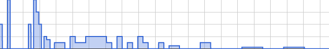
For a site with few page views, the probability distribution looks something like this:
And for a site with a large number of page views, the probability distribution looks like this:
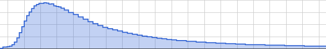
The x-axis is page load time while the y-axis is the number of data points that fell into a particular bucket. The actual number of data points that fall into a bucket is not important, it’s the relative value that is.
We notice that as the number of data points increases, the distribution becomes more striking until you’re able to map well known probability distribution functions (PDFs) to it. In this case, the load time looks a lot like a Log-normal distribution, ie, a distribution where the y-axis v/s the logarithm of the x-axis is Normal (or Gaussian) in nature.
You can read more about Log-normal distributions at Wikipedia and on Wolfram Alpha.
Now while these tend to be the most common, they aren’t the only distribution. We also sometimes see a bimodal distribution like this:

This often shows up when two different distributions are added together.
Central tendency
Now regardless of the distribution, we need a measure of central tendency to tell us what the “Average” user experience is. Note that I’ve included the term “Average” in quotes because it’s often misinterpreted. Most people use the term average to refer to the arithmetic mean. Statistically though, the Average could refer to any single number that summarises a dataset, and there are many that we can pick from.
The most common are the arithmetic mean, the median and the mode. There’s also the geometric mean, the harmonic mean and a few others that we won’t cover.
I’ll briefly go over each of these terms.
The arithmetic mean
The arithmetic mean is simply the sum of all readings divided by the number of readings. In the rest of this document, we’ll refer
to the arithmetic mean as amean or μ.
The best thing about the amean is that it’s really easy to calculate. Even with a very large number of data points, you only need to hold on to the sum of all points and the number of points. In terms of memory, this should require two integers.
The biggest drawback of the amean is that it is very susceptible to outliers. For example, the arithmetic mean of the following three sets is the same:
Set 1: 1, 1, 1, 1, 1, 1, 1, 1, 1, 91
Set 2: 6, 7, 8, 9, 10, 11, 12, 13, 14
Set 3: 2, 3, 3, 3, 4, 16, 17, 17, 17, 18
The median
Unlike the amean, the median actually does show up in the data set (more or less). The median is the middle data point (also called
the 50% percentile) after sorting all data points in ascending order. In the Set 2 above, the median is 10. Set 1 is slightly different
because there are an even number of data points, and consequently, two middle points. In this case, we take the amean of the two middle
points, and we end up with (1+1)/2 == 1.
The cool thing about medians is that they aren’t susceptible to outliers. The point with value 91 in Set 1 doesn’t affect the median at all. It reacts more to where the bulk of the data is.
What makes medians hard to calculate is that you need to hold a sorted list of all data points in memory at once. This is fine if your dataset is small, but as you start growing beyond a few thousand data points, it gets fairly memory intensive. (Ever notice how most databases do not have a MEDIAN function, but most spreadsheet applications do?)
Medians are also not a great measure of central tendency when you have a bimodal distribution like in Set 3. In this case we have
two separate clusters of data, but the median ends up being (5+15)/2 == 10, which isn’t even in the dataset.
The mode
We’ve mentioned bimodal distributions. The term bimodal comes from the fact that the distribution has two modes. Which brings up the question, “What is a mode?”. The French term la mode means fashion (the related phrase à la mode means in style). In terms of a data distribution, the mode is the the most popular term in the dataset.
Looking at our three datasets above, the modes are 1, n/a and (3, 17).
In the first set, the most popular (or frequent) value is 1. In set 3, it’s a tie between 3 and 17. In set 2, each term shows up only once, so there’s no “most popular” term.
When looking at large sets of real data though, we’ll approximate a bit, we may call a distribution multi-modal (or bimodal) if it has more than one term that’s far more popular than the others, even if all modes do not have equal popularity.
Looking back at our third distribution, we see that the two peaks aren’t of the same height, but they’re close enough, and each is a local maximum so we consider the distribution bimodal.
Finding a single mode involves finding the most popular data point in a data set. This isn’t too hard, and only requires a frequency table, which is less memory intensive than storing every data point. Finding multiple modes involves walking the distribution to find local maxima.
The geometric mean
Just like the arithmetic mean, the geometric mean involves counters. Unlike the aritmetic mean, it uses multiplication and roots rather than
addition and division. We’ll use the terms gmean or μg to refer to the geometric mean.
The geometric mean of a set of N numbers is the Nth root of the product of all N numbers. Writing this in code, it would look like:
pow(x1 * x2 * ... * xN, 1/N)The problem we’re most likely to encounter when calculating a geometric mean is numeric overflow. If you multiply too many numbers, your product is going to overflow sooner or later. Luckily, there’s more than one way to do things mathematically, and we can covert multiplication and roots into summation and division using logs and exponents. So the above expression turns into:
exp((log(x1) + log(x2) + ... + log(xN))/N)So when would one use the geometric mean?
It turns out that the amean is great for Normal distributions and similarly, the gmean is great for Log-normal distributions.
Spread
So we’ve looked at central tendency a bit, but that only tells us what our data is centered around. None of the central tendency numbers tell us how closely we’re centered around that value. We also need a means to tell us the spread of the data.
When dealing with means (arithmetic or geometric), we can use the variance, standard deviation or standard error. The method for calculating these numbers is mostly the same for arithmetic and geometric means, except that we’ll use exponents and logs for the geometric spread.
For the median, spread is determined by looking at other percentile values, quartiles and inter quartile filtering.
Arithmetic Standard Deviation
The traditional way of calculating a standard deviation involves taking the square of the difference between each data point and the amean, then taking the mean of all those squares, and finally taking the square root of this new mean. This is also called a Root Mean Square (RMS for short)
This requires us to keep track of every data point until we’ve calculated the mean.
A less memory intensive way, and one which can be streamed is to calculate a running sum of squares. If we then want the standard deviation at any point, we use the following expression:
sqrt(sum(x^2)/N - (sum(x)/N)^2)As data comes in, we need to add it to our sum and add its square to our sum of squares, and that’s about it.
The details of how we end up with this expression are well documented on the Wikipedia
page about Standard deviation, so I won’t go into them here. We’ll refer to the standard deviation using the terms SD or
σ.
Geometric Standard Deviation
The geometric standard deviation is almost the same, except we use log(x) instead of x, and once we get the final result, pass it to
the exp() function. Similar to the arithmetic standard deviation, we’ll use the symbol σg to refer to the
geometric standard deviation.
The one difference between arithmetic and geometric standard deviation is the notation we use for the spread. For arithmetic standard deviation, we use
μ ± σ whereas for the geometric standard deviation, we use μg */ σg.
Percentiles
As we’ve seen in the curves above, real user performance data can have a very long tail, and if you care about user experience, you’ll want to know how far to the right that tail goes. We can do this by looking at things like the 95th, 98th or 99th percentile values of the curve. The method of getting a percentile is exactly the same as the method for getting the median. We need to sort all data points in ascending order, and then pick the pth point depending on the percentile we care about.
For example, if we have 1 million data points, and want to know the 95th percentile, we’d look for the 1,000,000 * 0.95 == 950,000th point. Similarly, for the 75th or 25th percentiles, we’d look for the 750,000th or 250,000th points.
In Set 2 (reproduced below), with 9 points, what would the 95th and 25th percentiles be? For fractional indices, round down if your arrays are zero based.
Set 2: 6, 7, 8, 9, 10, 11, 12, 13, 14
Inter Quartile Range
The Inter Quartile Range is the middle 50% of data points in a set. It includes all points between the 25th and 75th percentiles. The IQR is more robust than the entire range (min, max) since outliers are not included in the set. IQR is actually a single number which is the difference between the 75th and 25th percentile numbers.
Data filtering
When dealing with real user performance data, we may need to apply two levels of filtering. The first is to strip out absurd data. Remember that as with any data received over a web interface, you really cannot trust that the data you’re receiveing was sent by code you wrote, or someone else trying to masquerade as your code. The best you can do is require sane limits on your inputs, and make sure they fit these limits.
In addition to limiting for sanity, you also need to split your data set into two (or three) parts, one of which includes typical data points, and the remainder including outliers. These are both interesting sets, but need to be analysed separately.
Band-pass & sanity filtering
If you’ve ever used a graphic equaliser on a music system, you’ve worked with a band pass filter. In the audio-electronics world, a band-pass filter passes through components of the audio stream that fall within a certain frequency band, while blocking everything else. For example, to enhance bass effects and dampen other effects, we might pass through signals between 20Hz and 200Hz and block everything else, or let something else deal with it through a parallel stream.
With performance data, we can define similar limits. You should never see a page load time less than 0 seconds, and in fact it’s highly unlikely that you’d see a page load time of under 50 milliseconds (loading content from cache may be an exception). It’s also unlikely that you’d see a page load time of over 3-4 minutes… not because it doesn’t happen, but because users are unlikely to hang around that long*.
Similarly, if you see timestamps in the distant past or distant future, chances are that it’s either fake data, or a very badly misconfigured system sending you that data. In both cases it’s probably something you want to drop (or pass to a separate handler for further analysis).
* Users may tolerate very long page load times if the page loads in a background tab and they never actually see it.
IQR Filtering
IQR filtering is based on the Inter Quartile Range that we saw earlier. Its job is to strip out outliers so we only look at typical data. To filter a
dataset using IQR filtering, we first find the inter quartile range (Q3-Q1).
We then define a field width of 1.5 times this range: fw = 1.5 * (Q3-Q1).
Finally, we run a band-pass filter on the data set with an open interval of (Q1-fw, Q3+fw). An open interval is one in
which the end points are not included, so your test would be x[i] > Q1-fw && x[i] < Q3+fw.
We can also include points that fall below the interval into a low-outliers group, and points that fall above the interval into a high-outliers group.
The great thing about IQR filtering is that it’s based on your dataset and not on some arbitrary limits derived from intuition ;) In other words, it will work just as well for datapoints coming in over a slow dialup network and datapoints coming in over a T3 line. A straight band-pass filter might not.
Example Numbers
As an example, here are some of the numbers we see for a near Log-normal distribution of data:
| Beacons | A-Mean | G-Mean | Median | 95th | 98th |
|---|---|---|---|---|---|
| 1.5M | 4.2s | 2.50s | 2.39s | 11s | 19s |
| 870K | 6.4s | 3.99s | 3.87s | 17s | 29s |
Notice how close the geometric mean and the median are to each other while the arithmetic mean gets pulled out to the right.
Endgame
We’ve gone over how to find central tendency and spread and how to filter your data. This covers everything you need to analyse your performance data. Have a look at the references for more information.
If you need an easy way to collect data, have a look at boomerang, LogNormal’s OpenSource Extendible JavaScript library that measures page load time, bandwidth, dns and a bunch of other performance characteristics in the user’s browser. It is actively developed and supported by the folks at LogNormal, and contributors from around the world.
And if you’d rather not do all of this yourself, have a look at the RUM tool we’ve built at LogNormal. Send us up to 100 million data points a month and we’ll do the rest.
Also, to celebrate Speed Awareness Month, we’re giving away 2 free months of our Pro service if you sign up at http://www.lognormal.com/promos/speedawarenessmonth.
Lastly, I will be speaking about this topic at Performance meetup groups around the US. The first one will be tomorrow (August 14, 2012) in Boston.
Thanks for following along, and let’s go make the web faster.

0 comments :
Post a Comment