![[philiptellis]](https://en.gravatar.com/userimage/3079306/f13167d69aa4e1cb5e5f131af4e38e3e.jpeg)
How does your site make your users feel?
Introduction
So you’ve come here for a post about performance, but here I am talking about emotion… what gives? I hope that if you haven’t already, then as this post progresses, you’ll see that performance and emotion are closely intertwined.
While we may be web builders, our goal is to run a business that provides services or products to real people. The website we build is a means of connecting people to that service or product.
The way things are…
The art and science of measuring the effects of signal latency on real users is now about 250 years old. We now call this Real User Measurement, or RUM for short, and it’s come a long way since Steve Souders’ early work at Yahoo.
Browsers now provide us with many APIs to fetch performance metrics that help site owners make sites faster. Concurrently, the Core Web Vitals initiative from Google helps identify metrics that most affect the user experience.
These metrics, while useful operationally, don’t give us a clear picture of the user experience, or why we need to optimise them for our site in particular. They don’t answer the business or human questions of, “Why should we invest in web performance?” (v/s for example, a feature that customers really want), or even more specifically, “What should we work on first?”.
Andy Davies recently published a post about the link between site speed and business outcomes…
Context influences experience,
Experience influences behaviour,
Behaviour influences business outcomes.
All of the metrics we collect and optimise for deal with context, and we spend very little time measuring and optimising the rest of the flow.
Switching Hats
Over the last decade working on boomerang and mPulse, we slowly came to the realisation that we’ve been approaching performance metrics from a developer centric view. We’d been drawing on our experience as developers – users who have browser dev tools shortcuts committed to muscle memory. We were measuring and optimising the metrics that were useful and easy to collect from a developer’s point of view.
Once we switched hats to draw on our experiences as consumers of the web, the metrics that really matter became clearer. We started asking better questions...
- What does it mean that performance improved by 100ms?
- Are all 100ms the same?
- Do all users perceive time the same way?
- Is performance all that matters?
In this post, we’ll talk about measuring user experience and its effects on behaviour, what we can infer from that behaviour, and how it affects business outcomes.
Delight & Frustration
In Group Psychology and the Analysis of Ego, Freud notes that “Frustration occurs when there is an inhibiting condition that interferes with or stops the realization of a goal.”
Users visit our sites to accomplish a goal. Perhaps they’re doing research to act on later, perhaps they want to buy something, perhaps they’re looking to share an article they read a few days ago.
Anything that slows down or prevents the user from accomplishing this goal can cause frustration. On the other hand, making their goal easy to find and achieve can be delightful.
How a user feels when using our site affects whether they’ll come back and “convert” into customers (however you may define convert).
The Link Between Latency & Frustration
In 2013, Tammy Everts and her team at Radware ran a usability lab experiment. The study hooked participants up to EEG devices, and asked them to shop on certain websites. Half the users had an artificial delay added to their browsing experience and neither group were made aware of the performance changes. They all believed they were testing the usability of the sites. The study showed that...
A 500ms connection speed delay resulted in up to a 26% increase in peak frustration and up to an 8% decrease in engagement.
Similarly in 2015, Ericsson ConsumerLab neuro research studied the effects of delayed web pages on mobile users and found that “Delayed web pages caused a 38% rise in mobile users' heart rates — equivalent to the anxiety of watching a horror movie alone.”
This may not be everyone’s cup of tea, and the real implication is that users make a conscious or unconscious decision on whether to stick around, return, or leave the site.
Cognitive Bias
Various cognitive biases affect how individual experiences affect perception and behaviour. Understanding these biases, and intervening when an experience tends negative can improve the overall experience.
Perceptual Dissonance
Also known as Sensory Dissonance, Perceptual Dissonance results from unexpected outcomes of common actions.

The brain’s predictive coding is what helps you do things like “figure out if a car coming down the road is going slow enough for you to cross safely”. A perceptive violation of this coding is useful in that it helps us learn new things, but if that violation breaks long standing “truths”, or if violations are inconsistent, it makes learning impossible, and leads to psychological stress, and frustration.
On the web, users expect websites to behave in a certain way. Links should be clickable, sites should in general scroll vertically, etc. Things like jank while scrolling, nothing happening when a user clicks a link (dead clicks), or a click target moving as the user attempts to click on it (layout shift) causes perceptual dissonance and frustration.
If these bad experiences are consistent, then users come to expect them. Our data shows that users from geographies where the internet is slower than average tend to be more patient with web page loads.
Survivorship Bias
We only measure users who can reach our site. For some users, a very slow experience is better than an unreachable site.
In 2012, after Youtube made their site lighter, Chris Zakariahs found that aggregate performance had gotten worse. On delving into the data, they found that new users who were previously unable to access the site were now coming in at the long tail. The site appeared slower in aggregate, but the number of users who could use it had gone up.
Negativity Bias
Users are more likely to remember and talk to their friends about their bad experiences with a site than they are about the good ones. We need only run a twitter search for “$BRAND_NAME slow” to see complaints about bad experiences.
Bad experiences are also perceived to be far more intense than equivalent good experiences. To end up with a neutral overall experience, bad experiences need to be balanced with more intense good experiences. A single bad experience over the course of the session makes it harder to result in overall delight.
Active Listening
Research shows that practicing Active Listening can have a big impact on countering Negativity Bias. Simply acknowledging when you’ve screwed up and didn’t meet the user’s expectations can alleviate negative perception. If we detect, via JavaScript, that the page is taking too long to transition between loading states, we could perhaps display a message that acknowledges and apologizes for things going slower than expected.
Hey, we realise that it’s taking a little longer than expected to get to what you want. You deserve better. We’re sorry and hope you’ll stick around a bit.
Users will be more forgiving if their pain is acknowledged.
Measuring Emotion
There are many ways we could measure the emotional state of users using our site. These range from active engagement to completely creepy. Naturally not all of these will be applicable for websites...
- Use affective computing (facial analysis, EEGs, pulse tracking, etc.)
- Ask the user via a survey popover
- Business outcomes of behaviour
- Behavioural analysis
Affective Computing
For website owners, affective computing isn’t really in play. Things like eye tracking, wireless brain interfaces, and other affective computing methodologies are too intrusive. They work well in a lab environment where users consent to this kind of tracking and can be hooked up to measurement devices. This is both inconvenient, and creepy to run on the web.
Ask the user
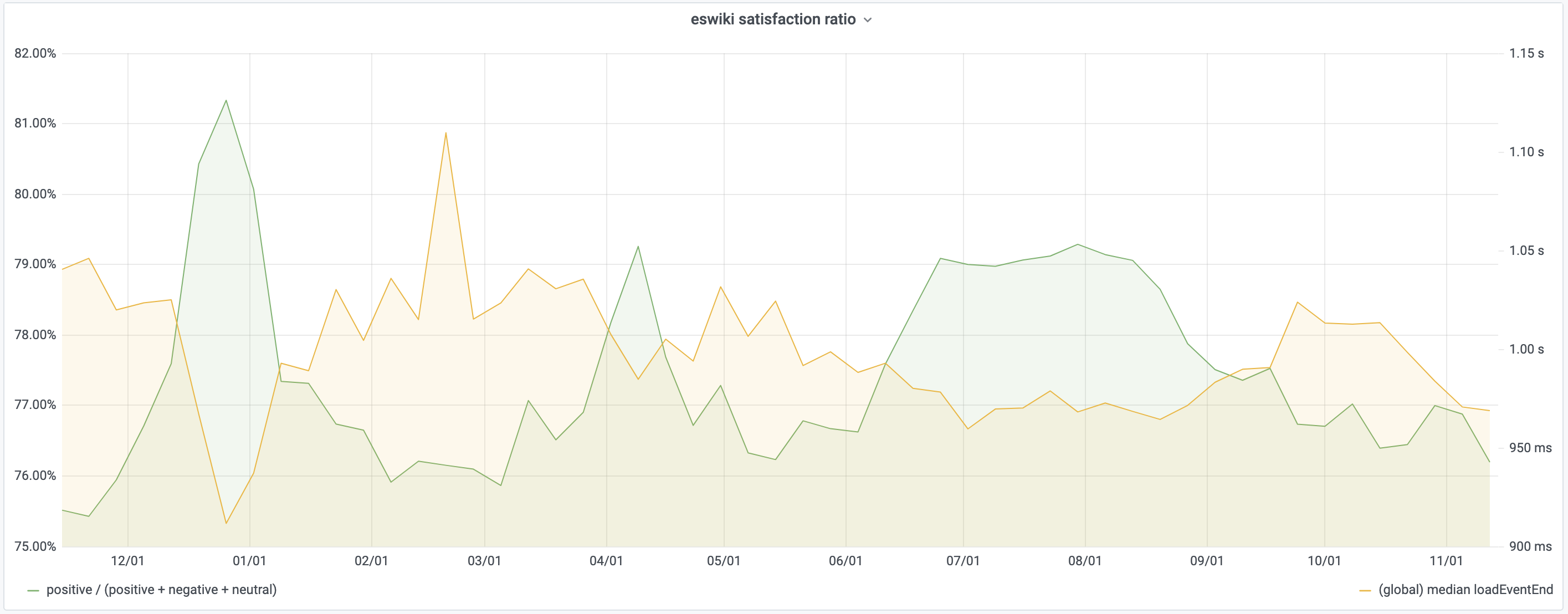
Asking the user can be effective as shown by a recent study from Wikipedia. The study used a very simple Yes/No/No Comment style dialog with randomized order. They found that users’ perceived quality of experience is inversely proportional to median load time. A 4% temporary improvement to page load time resulted in an equally temporary 1% extra satisfied users.
This method requires active engagement by the user and suffers from selection bias and the hawthorne effect.
It’s hard to quantify what kinds of experiences would reduce the effects of selection bias and result in users choosing to answer the survey, or how you’d want to design the popover to increase self-selection.
The Hawthorne effect, on the other hand, suggests that individuals change the way they react to stimuli if they know they’re being measured or observed.
Business Outcomes
Measuring business outcomes is necessary but it can be hard to identify what context resulted in an outcome. One needs to first understand the intermediate steps of experience and behaviour. Did a user bounce because the experience was bad, or did they just drop in to do some research and will return later to complete a purchase?
Behavioural analysis
Applying the results of lab based research to users actively using a website can help tie experience to behaviour. We first need to introduce some new terms that we’ll define in the paragraphs that follow.
Rage Clicks, Wild Mouse, Scrandom, and Backtracking are behavioural signals we can use. In conjunction with when in a page’s life cycle users typically expect different events to take place, they can paint a picture of user expectations and behaviour.
Correlating these metrics with contextual metrics like Core Web Vitals on one hand, and business outcomes on the other can help us tell a more complete story of which performance metrics we should care about and why.
Rage, Frustration & Confusion
To measure Rage, Frustration & Confusion, we look at Rage Clicks, Wild Mouse and Backtracking.
Rage Clicks
Rage Clicks occur when users rapid-fire click on your site. It is the digital equivalent of cursing to release frustration. We’ve probably all caught ourselves rage clicking at some point. Click once, nothing happens, click again, still nothing, and then on and on. This could be a result of interaction delays, or of users expecting something to be clickable when it isn't.
Rage clicks can be measured easily and non-intrusively, and are easy to analyse.
Fullstory has some great resources around Rage Clicks.
Wild Mouse
Research shows that people who are angry are more likely to use the mouse in a jerky and sudden, but surprisingly slow fashion.
People who feel frustrated, confused or sad are less precise in their mouse movements and move it at different speeds.
There are several expected mouse movements while a user traverses a website. Horizontal and vertical reading patterns are expected and suggest that the user is engaged in your content.
On the other hand, random patterns, or jumping between options in a form can suggest confusion, doubt, and frustration. See Churruca, 2011 for the full study.
The JavaScript library Dawdle.js can help classify these mouse patterns.
Scrandom
Scrandom is the act of randomly scrolling the page up and down with no particular scroll target. This can indicate that a user is unsure of the content, the page is too long, or is waiting for something to happen and making sure that the page is still responsive without accidentally clicking anything.
Backtracking
Backtracking is the process of hitting the back button on the web. Users who are confused or lost on your site may hit the back button often to get back to a safe space. This behaviour may manifest itself in different ways, but can often be identified with very long sessions that appear to loop.
Tie this into the Page Load Timeline
In his post on Web Page Usability, Addy Osmani states that loading a page is a progressive journey with four key moments to it: Is it happening? Is it useful? Is it usable? and Is it delightful? And he includes this handy graphic to explain it:

The first three are fairly objective. With only minor differences between browsers, it’s straightforward to pull this information out of standard APIs, and possibly supplement it with custom APIs like User Timing.
We’ve found that over 65% of users expect a site to be usable after elements have started becoming visible but before it is actually Interactive. Contrast that with 30% who will wait until after the onload event has fired.
Correlating Rage with Loading Events
Comparing the points in time when users rage click with the loading timeline above, we see some patterns.
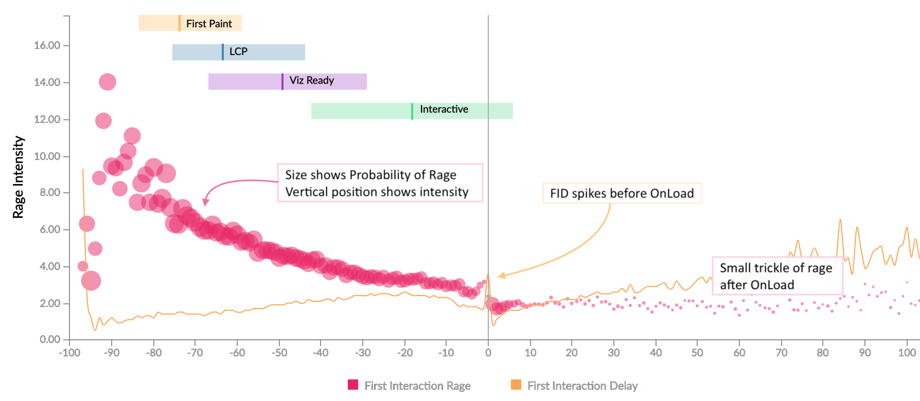
We see a large amount of rage between content becoming visible and the page becoming interactive. Users expect to be able to interact with the page soon after content becomes visible, and if that expectation isn’t met, it results in rage clicking.
We also see a small stream of rage clicks after the page has completed loading, caused by interaction delays.
There’s a small gap just before the onload event fires. The onload event is when many JavaScript event handlers run, which in turn result in Long Tasks, and increased Interaction Delays. What we’re seeing here is not the absence of any interaction, but survivorship bias where the interactions that happen at that time aren’t captured until later.
The horizontal axis on this chart is relative time along the page load timeline. We looked at various combinations of absolute and relative time across multiple timers, and it was clear that relativity is a stronger model, which brings us to a new metric based on relative timers...
Frustration Index
The frustration index, developed by Tim Vereecke, is a measure based on the relation between loading phases. We’ve seen that once one event occurs, users expect the next to happen within a certain amount of time. If we miss that expectation, the user's perception is that something is stopping or inhibiting their ability to complete their task, resulting in frustration.
The Frustration Index encapsulates that relationship. The formula we use is constantly under development as research brings new things to light, but it’s helpful to visit the website to understand exactly how it works and see some examples.
So how do we know that this is a good metric to study?
Correlating Rage & Frustration
It turns out that there is a strong correlation (ρ=0.91) between the intensity of rage (vertical axis) that a user expresses and the calculated frustration index (horizontal axis) of the page.
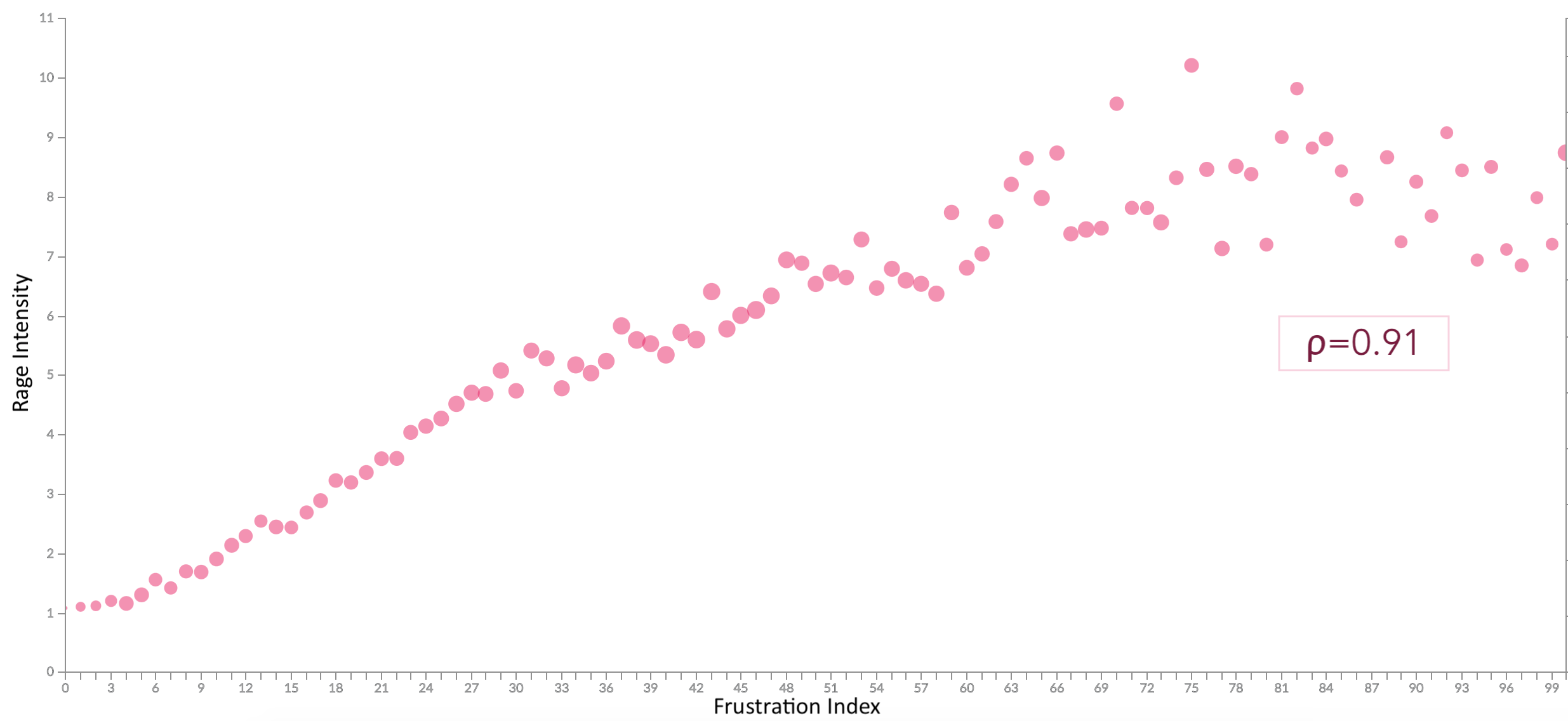
Rather than looking at individual timers for optimization, it is better to consider all timers in cohesion. Improving one of them changes the user’s expectation of when other events should happen and missing that expectation results in frustration.
However, further to this, the formula is something we can apply client-side to determine if we’re meeting expectations, and practice active listening if we’re not.
Correlating Frustration & Business Outcomes
Looking at the correlation between Frustration Index and certain business metrics also shows a pattern.

- Bounce Rate is proportional to the frustration index with a sharp incline around what we call the LD50 point (for this particular site). ρb=0.65
- Average Time spent on the site goes down as frustration increases, again sharply at first and then tapering off. ρt=-0.49
LD50
The LD50, or Median Lethal Dose is a term borrowed from the biological sciences. Buddy Brewer first applied the term to web performance in 2012, and we’ve been using it ever since.
In biology, it’s the dosage of a toxin that kills off 50% of the sample, be it tumour cells, or mice.
On the web, we think of it more in terms of when 50% of users decide not to move on in their journey. We could apply it to bounce rate, or retention rate, or any other rate that’s important to your site, and the “dose”, may be a timer value, or frustration index, or anything else. Depending on the range of the metric in question, we may also use a percentile other than the median, for example, LD25 or LD75.
This isn’t a single magic number that works for all websites. It isn’t even a single number that works for all pages on a site or for all users. Different pages and sites have different levels of importance to a user, and a user’s emotional state, or even the state of their device (eg: low battery), when they visit your site can affect how patient they are.
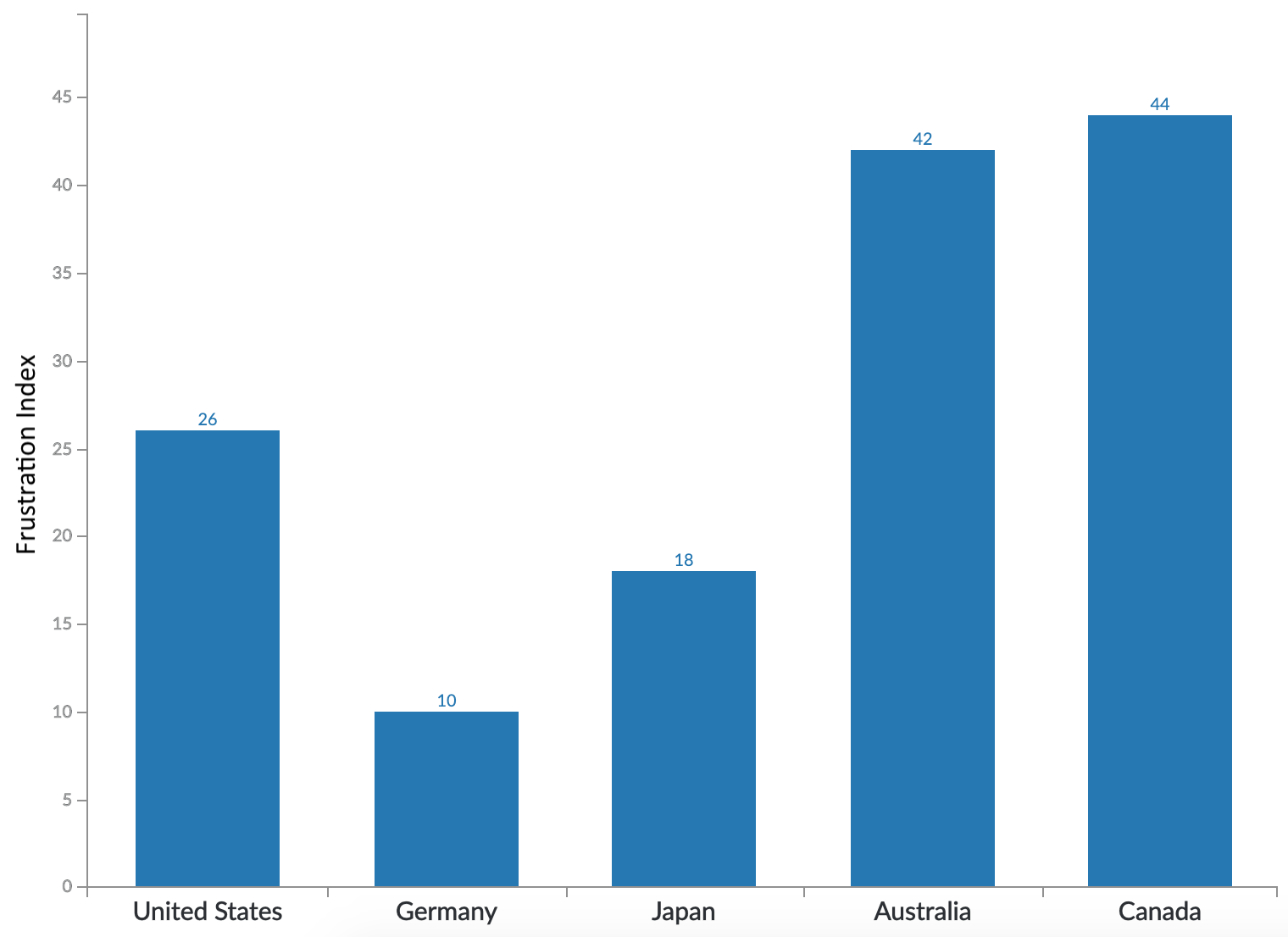
Patience is also a Cultural Thing
People from different parts of the world have a different threshold for frustration.
Many of our customers have international audiences and they have separate sites customized for each locale. We find that users from different global regions have different expectations of how fast a site should be.
In this chart, looking at 5 high GDP countries (that we have data for), we see a wide distribution in LD25 value across them, ranging from a value of 10 for Germany to the 40s for Australia and Canada. It’s not shown in this chart, but the difference is even wider when we look at LD50, with Germany at 14 and Canada at 100.
So how fast should our site be?
We’ve heard a lot about how our site’s performance affects the user experience, and consequently how people feel when using our site. We’ve seen how the “feel” of a site can affect the business, but what does all of that tell us about how to build our sites?
- How fast should we be to reduce frustration?
- What should we be considering in our performance budgets?
- How do we leave our users feeling happy?
I think these may be secondary questions…
A better question to start with, is:
Will adding a new feature delight or frustrate the user?
References
- Computer Rage on Wikipedia
- The Psychology of Computer Rage
- A third of Americans confess to verbal or physical abuse of their computers
- Computer Rage affects more than half of Britons
- Social and Psychological Influences on Computer User Frustration
- The impact of network speed on emotional engagement
- Ericsson ConsumerLab neuro research 2015
- Negativity Bias on Wikipedia
- The fastest way to pinpoint frustrating user experiences
- The 7 best reasons for swearing
- Emotional Design
- Frustration Index
- Page Weight Matters
- Improving UX through Front End Performance
- Guide to understanding frustrating user experiences online
- This computer responds to user frustration: Theory, design & results. [PDF]
- Toward a more civilized design: studying the effects of computers that apologize
- Websites could read emotions by seeing how fast you move your mouse
- Your users are frustrated
- Patterns of cursor movement for different devices [PDF]
- Wikipedia Paper on User Satisfaction v/s Performance
- Wikimedia Performance Team: Perceived Performance
- Strengthening The Link between Site Speed and Business Outcomes
- Web page usability matters
- Median Lethal Dose or LD50
- Tying web performance data to human behavior
Acknowledgements
Thanks to Andy Davies, Nic Jansma, Paul Calvano, Tim Vereecke, and Cliff Crocker for feedback on an earlier draft of this post.
Thanks also to the innumerable practitioners whose research I've built upon to get here including Addy Osmani, Andy Davies, Gilles Dubuc, Lara Hogan, Nicole Sullivan, Silvana Churruca, Simon Hearne, Tammy Everts, Tim Kadlec, Tim Vereecke, the folks from Fullstory, and many others that I'm sure I've missed.

0 comments :
Post a Comment